Shapash webapp
SixFoisSept's contribution to openSource
SixFoisSept was created in 2019 with ethics, operational excellence and the deep conviction that we could share some of our know-how. Therefore pooling our developments and our data has enabled all french collectivities to benefit a dashboard for analysing and managing their KPIs with Le Cadran application.
It seemed natural to us to bring our expertise to the Python Library built by MAIF and its partners. Contributing to the OpenSource world by collaborating with MAIF on their Shapash tool was natural and also marks many years of collaboration between the insurance company and the SixFoisSept management team.
Our technical and project expertise acquired in the development of Le Cadran was put to good use to optimize the Shapash interface. We are delighted to open up and share our know-how by proposing these evolutions.
Shapash webapp
Shapash is a Python library implemented by MAIF that make machine learning interpretable and understandable by everyone. A web application is attached to this library to allow data scientists to quickly understand their models by navigating between global and local explainability and understand how the different features contribute. This web application must be userfriendly and therefore allow non specialists understand the model. The current version of the webapp have to be improved to support those new features.
For this purpose, SixFoisSept has brought its Dash expertise to improve this web application. The Webapp has been improved with new features such as new graphs and functionalities.
New Features and improvement
- Top menu
The top menu (cf Figure 1) has been improved to be responsive design and fit the screen size. The space available for the webapp title has been increased as well as the field to select the class label. Finally, the 'class' label was moved to the left of the class label because it looks better than above it.
- Create tab which contains a new graph (prediction picking) and work on connection with other graphs
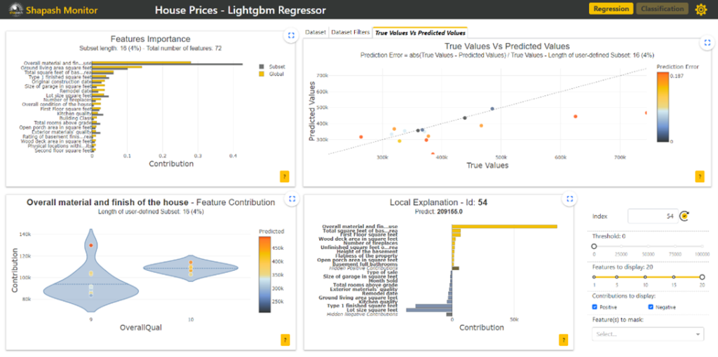
The prediction picking graph (detailed in paragraph “True Values Vs Predicted Values” and visible on Figures 5 & 7) is now available in a new Tab element named “True Value Vs Predicted Values” in Shapash. This graph is connected to the data table (available in the Tab element named “Dataset”) and the other graphs. The user can use box select button to select a subset in this graph to view that subsample in the table and graphs. To deselect the subset, the user can double-click on the graph.
- Add responsive titles, subtitles and axis titles to each graph
Each graph (cf Figures 2, 3, 4 & 5) now contains titles, subtitles and axis. These information are responsive to the screen size.
- Adapt the labels of graphs according to their size
When the size of the label is too large, some labels may overlap when on a 13-inch screen. In this case, the graphic loses legibility and therefore understanding. To overcome this problem we have decided to adapt labels according to their size. If the size of a label on the x-axis is greater than 10, only the first three and last three characters are displayed, separated by "..." (cf Figure 3). The same applies to the Y axis when the size of a label is greater than 30 (cf Figures 2 & 4). This let us have better graph visualization. When you click on the zoom button, the labels appear in full.
- Add explanation buttons and popups
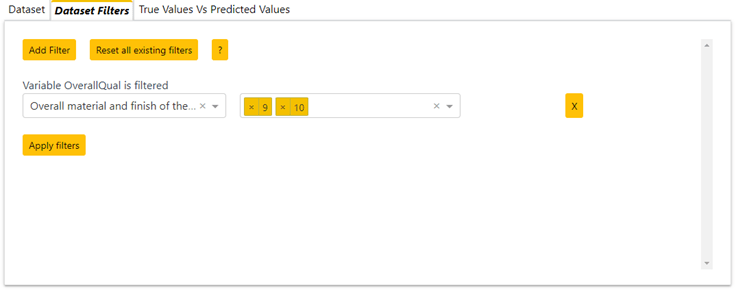
- As Shapash want to be easy to use, explanation buttons have been added to each graph (cf Figures 1 to 7) . These buttons have to be intuitive and allow users to understand, in one click, how each graph or filter works. If the user move the mouse over one of these buttons, a popover will appear to explain the purpose of it. If the user click on it, a modal (popup) containing explanations about the graph selected will appear. This modal may contain hyperlinks that redirect the user to a new browser tab that contains more explanation. This explanation button also exists for the filters and explains the user how he can filters the data. Add Tab that contains dataset filters
This Tab element named “Dataset filters” (cf Figure 6) contains buttons to add or reset filters on the data set. The format of the filters is adapted according to the type of variable selected:
- for Boolean variable: radioItems component ;
- for string variable: dropdown component ;
- for integer variable (less than 20 modalities): dropdown component ;
- for integer variable (upper than 20 modalities): less and upper input values ;
- for float variable: less and upper input values ;
- for date variable: DatePickerRange component.
It is possible to select as many new filters as needed. To apply filter the user must click on the Apply Filter button. Filters will be applied to the data table and graphs. If you delete a filter using the (X) button, it is necessary to click on the Apply Filter button again for the data table and graphs to be updated. To delete all filters it is possible to click on the reset filters button.
When filters are applied it is always possible to select subset in prediction picking graph. Then the subset available in the other graphs becomes the one selected. This subset can be unselected by double clicking in the graph. Then the filter applied to the data will be the initial filter.
Use case application
We propose to illustrate these improvements with a use case realized from the public Kaggle dataset House Prices - Advanced Regression Techniques | Kaggle. This dataset includes about 70 variables describing a house, such as the aspect and equipment of the house, the surface of the rooms or the number of fireplaces, etc. These informations help explaining the price of the property.
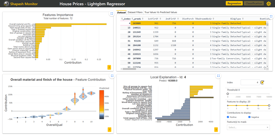
Shapash is a wep application divide in six parts, each one interacts to facilitate model and data exploration.
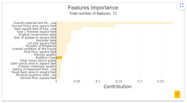
- Features Importance: This graph shows to the user the contribution of each feature. The user can click on each of them to update the contribution plot below. Here we have clicked on the Building Class feature.
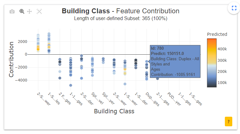
- Contribution plot: This graph shows to the user how does a feature influence the prediction. It can display violin or scatter plot of each local contribution of the feature. The user can click on each point (here the house with id=780) to display the associated local explication plot.
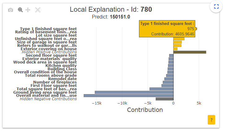
- Local explanation plot: This graph shows to the user the local explanation plot to understand which features contribute the most to the predicted price of this house.
- Dataset: This table contains all the data on housing prices as well as the prices predicted by the model. The user can select a single row to display the associated local explication plot on a specific house.
- True Values Vs Predicted Values: This scatter plot allows the user to compare predicted prices to actual house prices. It is easy to observe the data where the model is not correct and focus on this data by selecting it. This action is named sample picking.
Sample picking is a process with great added value to better understand models, their strengths and weaknesses. This approach is explained in detail in Sample Picking article.
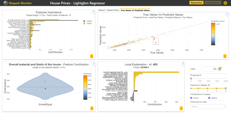
The local explanation plot on the house 482 shows this is the first feature (overall materials and finish of the house) that contribute the most to the predicted price of this house. It is possible to add a filter on this variable to analyze the houses with a high level of finishing as it is the case here.
- Dataset Filters: It allows the user to select a subset using filters and to focus his exploration on this subset. This is a complementary approach to the "picking sample" which allows the user to better understand the model with the help of examples intelligently selected by the user. It can then use the set of graphs to compare this sub-sample to the whole data set and understand how the model works on it.